FMP 2 — REFINING IDEAS & WORK
ACADEMIC RESEARCH: 'THE SUBLIME & WATER'
My research into the sublime makes a parallel between the romantic spectacle of Turner’s shipwrecks with the contemporary vastness of extractive capitalism and its environmental consequences. I also discuss the importance of water in the sublime.
What is sublime? A building or a mountain may be sublime, as may a thought, or a mode of expression. ‘The sublime is not restricted to a judgement of value, it also describes a state of mind’ (9). The cavernous interior of Cologne Cathedral instilled me with awe, the idea of infinity is beyond words.
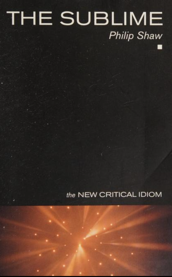
I have been reading ‘The Sublime’ by Philip Shaw. The presence of water in my existing work led me to think about the traditional and romantic representation of the sublime. Water has the qualities of instability — shifting surfaces, sea-change and an immense depth of ‘blue-space’. We can drown in that blue, the sea can consume us (as it consumed my box of artwork). I think about Turner’s seascapes, those freely circulating bodies, how powerful scales of nature consume vessels. There is something truly terrifying about the shipwreck; as a traumatic event that is about the nature of human survival. As disaster unfolds, social ties between crew break down, even to the extent that unthinkable acts like cannibalism and the transgression of taboos become reality (10). There is an ‘abject’ in this romantic notion of shipwreck being sublime. Evident in Edmund Burke’s emphasis on anguish, torment and death as being productive of the sublime (11).
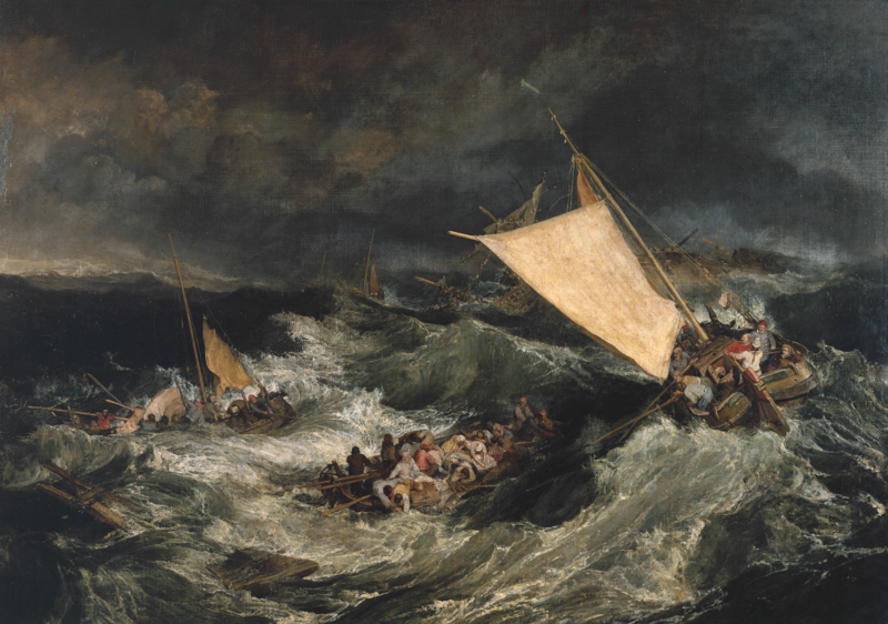
JMW Turner
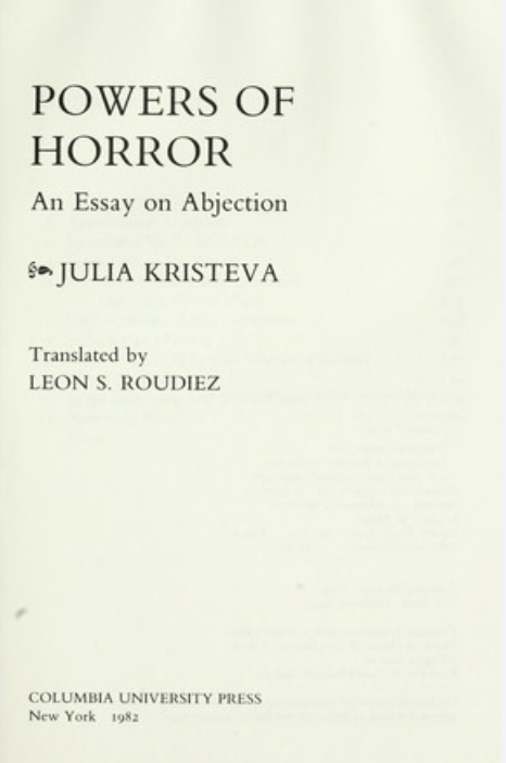
Amazement and wonder exert an invincible power upon us — sublimity tears everything up like a whirlwind and pulverises all facts like a thunderbolt. The sublime is something that is paradoxical, unfulfilled or self baffling, ‘it is something beyond definition; we cannot point to the rules that will govern its regulation’ (11). It is completely fluid, like water. I am reminded of Julia Kristeva and her work on ‘semiotics’ and the ‘abject’. Kristeva tells us in Powers of Horror that ‘the abject is always edged with the sublime’ and that ‘the sublime, just like the ‘abject’; it is fundamentally unknown and ambiguous. The abject is resistant to distillation, fear is a ‘fluid haze, an elusive clamminess’ (12). Both the sublime and the ‘abject’ have these qualities; they are beyond the human scale, on the edge of our symbolic frontiers.
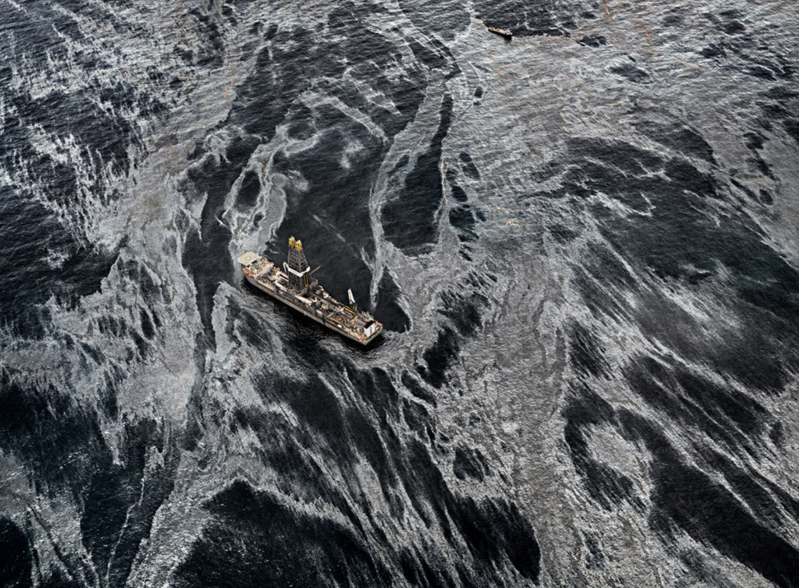
Oil spill in the Gulf of Mexico, 2010
It only feels right to use Kristeva’s theories in my writing. She is a philosopher and critic who I came across whilst working on my A levels. I have definitely found an affinity with her way of writing about edges, borders and fluids. Her writing often employs water; specifically oceans, rivers and amniotic fluid; as a central symbolic element that is related to the maternal (13). All life originates from water; it is the primordial soup; the most abundant molecule in living matter. There is a terrifying pull towards the beauty of water and its darkness underneath. We associate water with the internal experience, for our bodies are made up of countless. We cannot consciously control fluid; neither in our bodies or in the ocean, but we feel a constant attraction to its state of flux.
If the initial version of the sublime is Turner's shipwrecks and insurmountable glacial mountains; then the contemporary version of the sublime returns to those same bodies of water. This time it is concerned with the uncontrolled forces welling up to pollute the Gulf of Mexico, the deforestation along the Amazon basin, or the melting of our glacial ice sheets. The contemporary sublime is, I think, the capitalist system and its gargantuan feats of spatial domination. American art critic Thomas McEvilley declared that 'the unknown face of global capitalism is terrifying in its vastness and complexity'. In this sense, capitalism is the master-abstraction of human processes, never clear to the viewer — this sense of obscurity adds to its sublimity (14). I think about water and its significance in the complex global system of resource allocation. Across the world we can see the efforts of two empires trying to control narrow straits of water. I know that colonisation happened through ocean routes. In our future the scarcity of water will cause mass migratory movements across our world. And artificial intelligences continues to use fresh water faster than we can replenish it. Water is and always will be deeply intertwined with our human condition.
SEA SCAPE
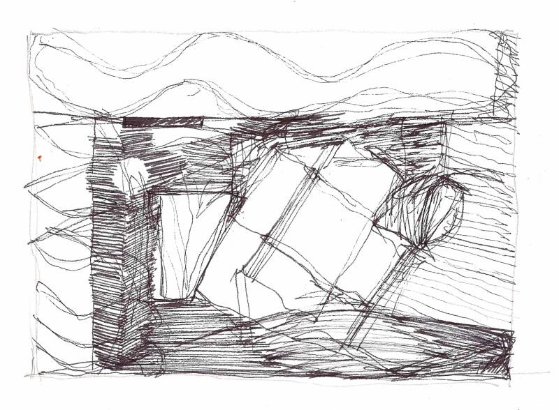
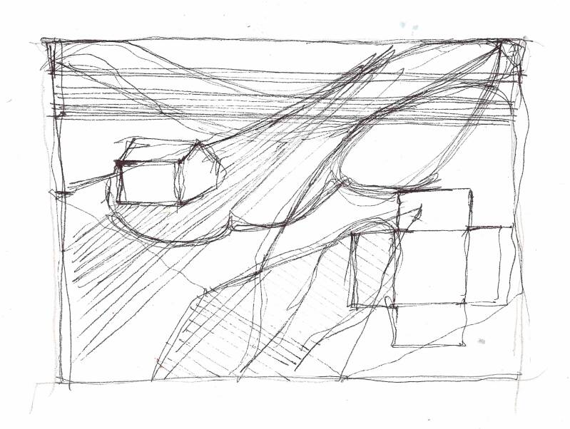
I am very inspired by the idea that so much of our human identity is built upon water. Water is the ultimate carrier of information. Water plays an intimate role in maintaining coherence — nearly 75% of our brain is composed of water.
With a new inspiration from JMW Turner and my research into the sublime, I return to my initial dream about flooding. This time, I want to paint something massive, something that demonstrates a large volume of moving water. I use quick sketches (shown above) to plan out my painting.
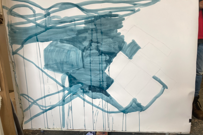
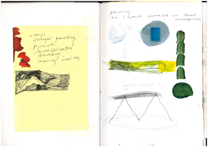
I start painting in blue, one single colour, to understand the dimensions and composition of my painting. Immediately, I realise that working at this scale demands thicker brushes and bigger pots of paint. There is a level of 'uncontrol' that I like when using liquids in larger scales. I alternate the painting between standing up and laying down on the floor. When the painting is on the floor, pigment pools. When the painting is standing up, pigment drips and runs. The whole time I am thinking about deep greens, blues and greys that are present in the river and the sea. The moving masses and layering of paint reminds me of the disrupted surface of water. The crashing waves of Turner's shipwrecks. The confluence between two rivers.
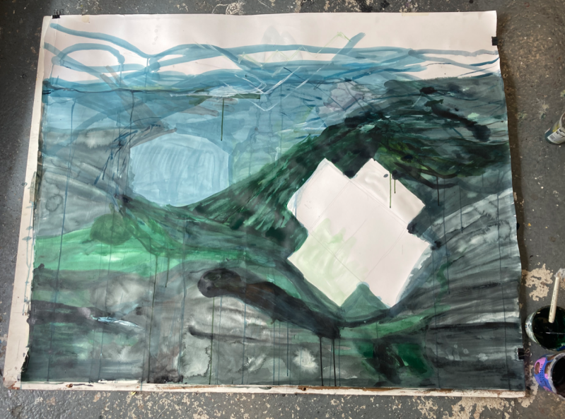
Two structures are present in this painting; one tight and curled up like a ball; the other is folding out and collapsing. Two geometric blocks bring contrast to this painting. I want to make sure that the edges of these structures are neat and angular, contributing to the sense of contrast.
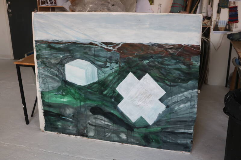
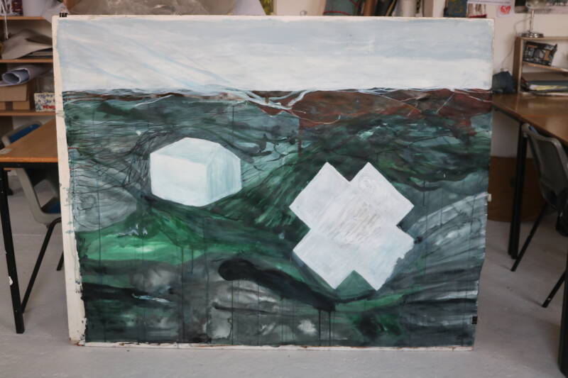
'Aloft', acrylic paint, 130 x 87 cm
This is a sea scape, but it is not referential. It does not exist in real life. They are figureless paintings. I really like the colour grey, it drifts, a white colour shifts into another. A lot of what is here is about tonality, purity and being contemplative. Blue is a very contemplative colour, busy dissolving in on itself. Towards the end of the painting, I spend time working on the horizon line — breaking it up by dragging the sky into the water.
Even though there is a horizon line, I feel as though this painting down from the perspective of an arial view. That is why I named this painting 'Aloft'. It about witnessing something great, that can only be witnessed from the sky. In this way, my title for this piece relates very closely with the sublime and its awe-inspiring nature.
PAINTING SERIES (WATER)
After doing a large painting, I am now working on a much smaller scale; these next paintings vary in size between A4 and A3. I want to continue to paint landscapes that do not exist. I want to continue painting something that is fluid — paintings that keep the viewers eyes circulating around the plain.
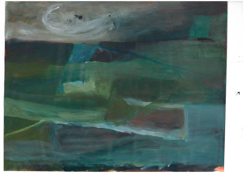
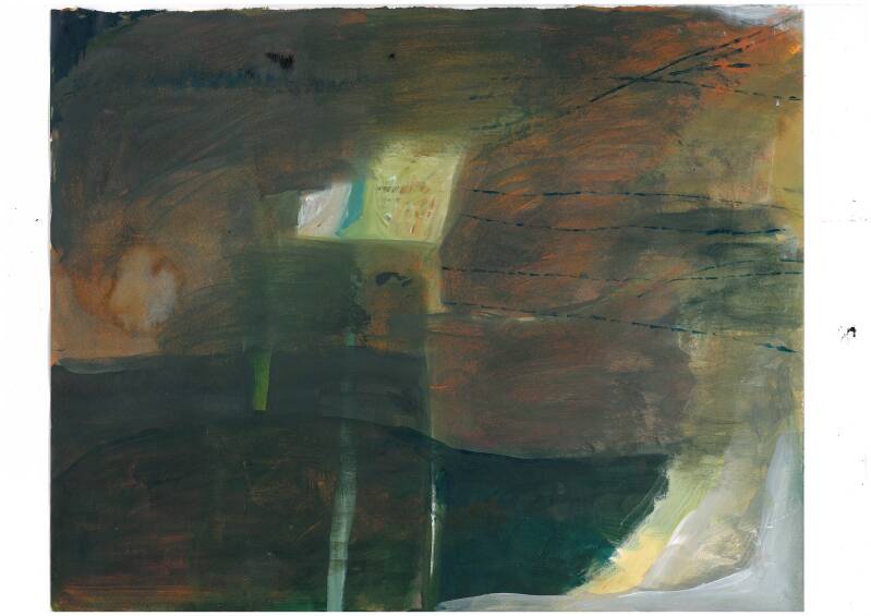
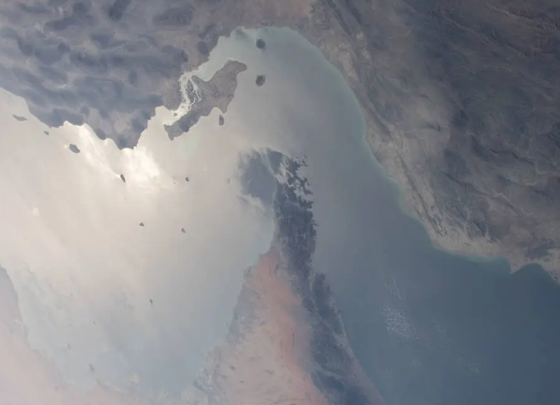
I thought that these first paintings were very successful. I painted a sepia undercoat. This meant that the colours were warmer and more luminous. I think that there is a lot of depth and harmony in these painting. In my second painting, there is an olive green knot right at the centre of the page. All of the other colours seem to originate from that light spot and circulate around it. I think about the narrow straits of water; the Hormuz, the Panama, the Suez and the Malacca that have all become critical chokepoints in our global system of trade.
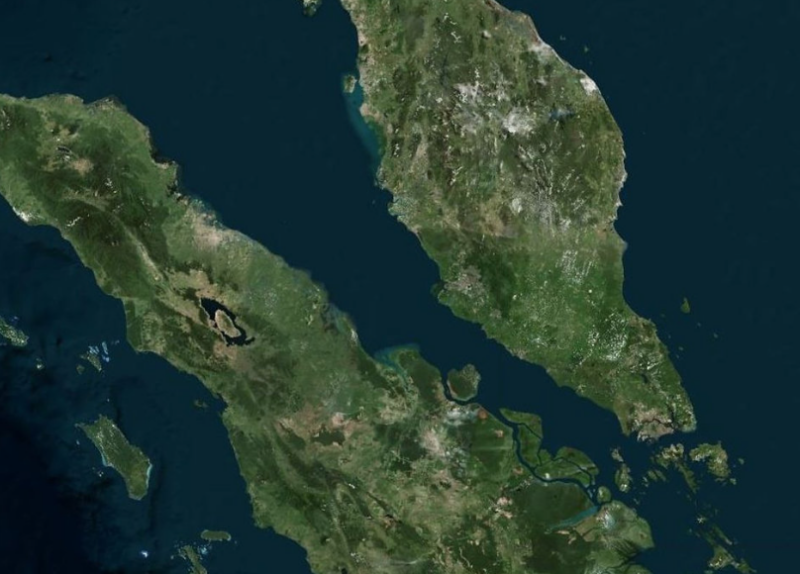
Strait of Malacca, Indonesia
Strait of Hormuz, Iran
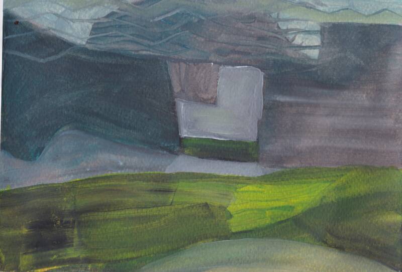
I try using a different type of paper in these paintings and instead of using acrylic paints I am using vivid inks mixed with white acrylic paint. The result is a more hazy and cloudy painting that appears more like the sky rather than the earth.
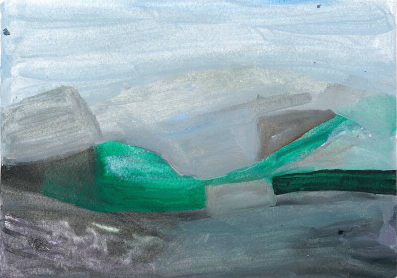
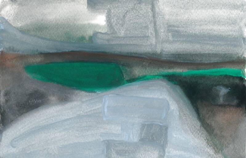
The colours in these paintings are very complex, the way they drift into one another presents so much movement between forms.
I like how I can see all of my brushstrokes. Sometimes I use small directed brushstrokes which result in linear articulations. Other times, I want the paint to seep uncontrollably like clouds of pigment, and at that point, the brushstrokes become invisible. Parcels of solid form are squeezed by amorphic masses. Colours and forms coexist next to each other, some very peacefully others much more violently. This is where both beauty and tension rests.
If I am interpreting my paintings in the context of my research into the sublime and the rising sea levels that threaten civilisation, then these paintings remind me of land slides, roads submerged under water, ice sheets sliding, parcels of air being squeezed by water, or the glacial mountains slowly melting. I like how these giant connotations are being squeezed inside of these small paintings. I hope that the viewer will be able to feel both tension and serenity when looking at these paintings.
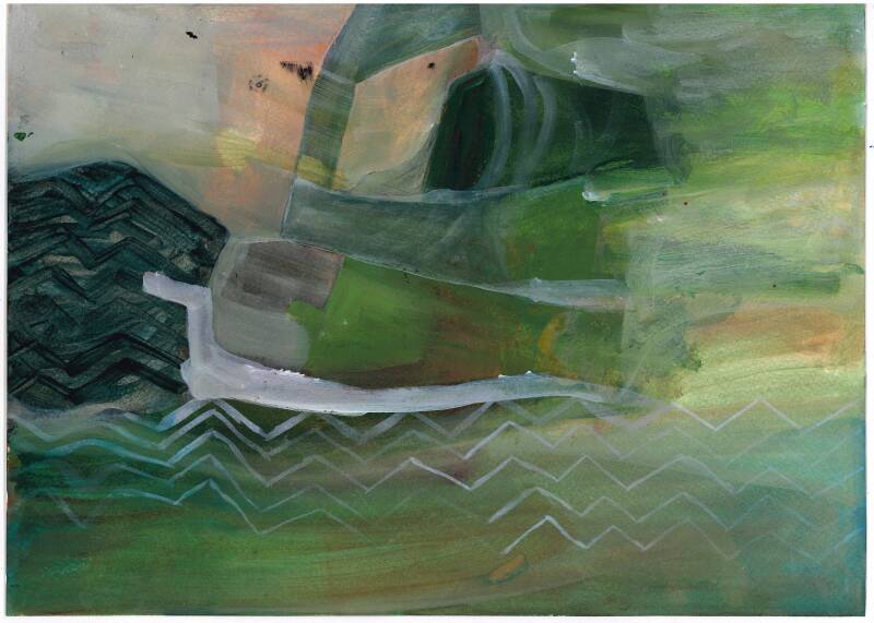
My paintings prompted a series of drawings. For me, drawing is a quicker process than painting. I do not have to think about mixing colour. It is an impulsive, hand to eye reaction. These next drawings are simple and quick. I think that there is a lot of parallels between my drawings and paintings. They both contain a lot of fluid movement and they both contain forms that contrast with one another, work in tension, narrow spaces that expand into great fields. In these drawings I can see how shapes dissolve and submerge into one another. Through lots of crosshatching I create a dense spot in the middle of the drawing. I see how different surfaces merge and overlap.
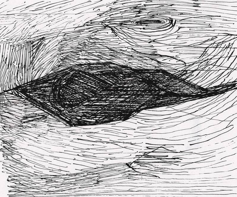
'Submerged', ink drawing, 10 x 7.3 cm
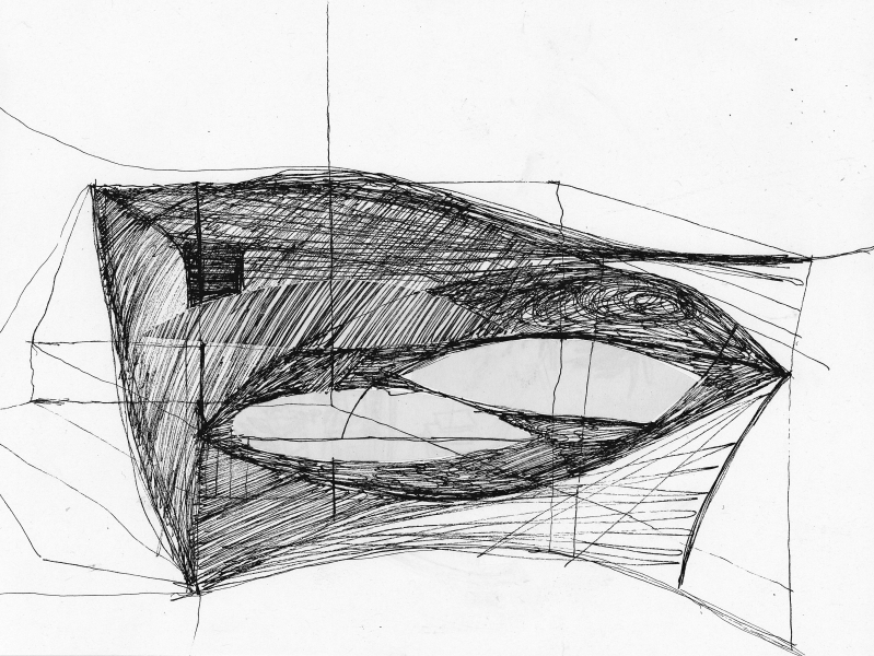
I overlap two different types of paper in these drawings; white cartridge paper and a grey newsprint. I am trying to create an object that is very directional. All of these black lines are pointing in different directions, but they all come together to form a sort of geometric vessel or sailing boat. I feel that drawing is always where sculpture begins. I can therefore see my work becoming sculptural again.
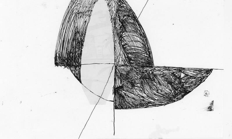
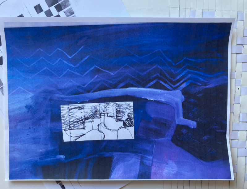
I send one of my paintings alongside one of my ink drawings through the my photocopier. It comes out all blue. This happened because yellow and magenta are missing, meaning that my printer cannot produce black or other colours properly, resulting in a blue/green hue. I am attracted to monochrome; there is a lot of clarity in it. It is easier to view, there is less distraction even though you still get lots of tonal oscilations.
EXPERIMENTING WITH WEAVING
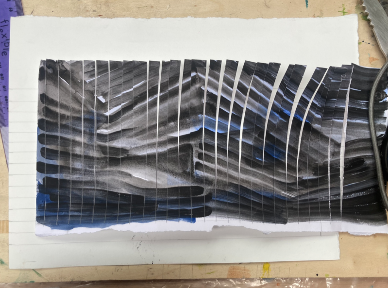
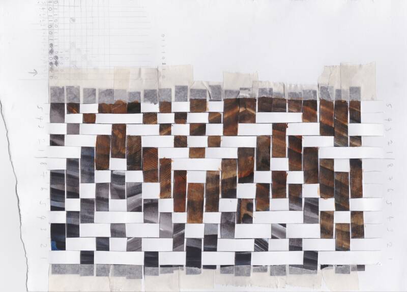
I wanted to do some weaving with one of my paintings. I am inspired by two of my friends in my art class who are making large scale weaves on a loom. I hope that by cutting up my painting and using it as the warp (vertical threads) and using plain white paper as the weft (horizontal threads) I will create an image that sits between painting, drawing and textile.
Whilst I am making, I realise how much time it takes to weave paper. Even though this drawing is very small, it still takes me about half an hour to make. I am quite pleased with how it turned out. I like the way I have made mistakes and missed out going over a warp — mistakes in weaving are called floats.
I am thinking about how geometric and mathematical this experiment has become, weaving relies on a structural and binary language. Given that this process is quite structural I am taken aback by how much this small experiment reminds me of waves. Waves are also mathematical, they are described through trigonometric identifies. I think that the back and forth motion of waves has been captured quite nicely.
I am reminded by my previous experiment with the monocoque technique.
I scan my weave into the photocopier and it also comes out as blue again. I decide to fold this photocopy sheet of paper, an action that has already been used as one of my visual tools in earlier work. As I make more and more work, my artwork becomes increasingly self-referential, in terms of both ideas and processes.
I reinforce the thin paper with two rows of mod roc. This allows the paper to stand up on its own, thus becoming a small sculpture in its own right.
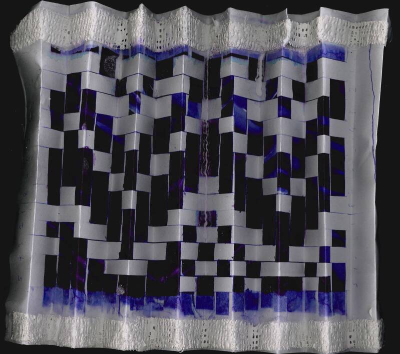
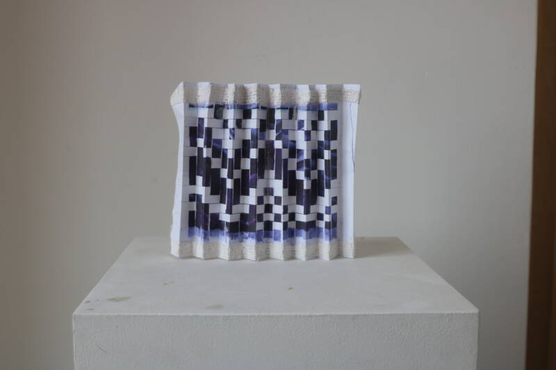
My weaving experiment reminded me of the structure of staircases.
CONTAINERS FOR WATER
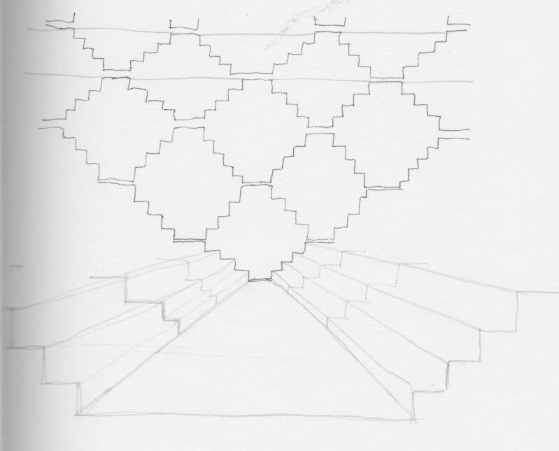
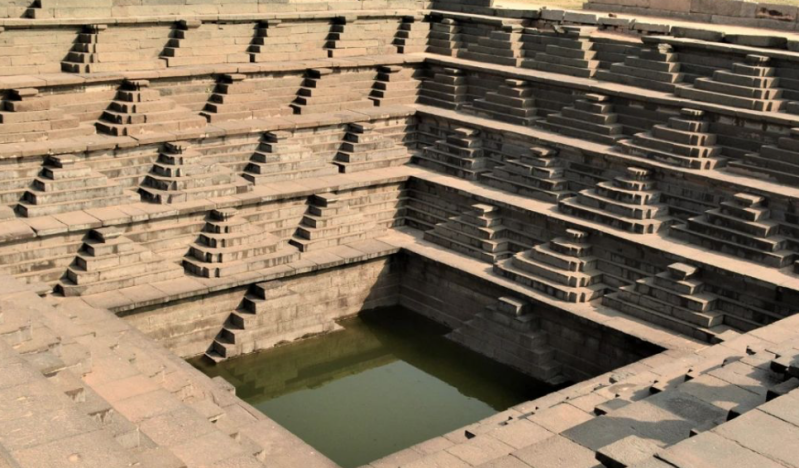
Human architecture can definitely be sublime. The inverted fortresses of northern India that mesmerically vanish into bodies of deep water are certainly sublime. In northern India, water collection has long been woven into the region’s architecture and daily life. In dry areas such as Rajasthan and Gujarat, communities built intricate step wells, known as baolis or vavs, which allowed people to reach underground water during harsh summers. To me, they are totally enthralling. They feel like a place to worship water. I really want to visit these steps.
My drawings below seek to centre a body of water or a human body at the centre of a geometric pattern or architecture. I think that these drawings will contribute to my generation of final ideas.
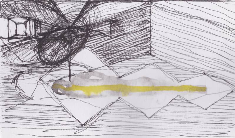
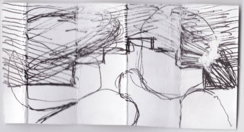
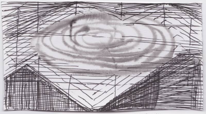
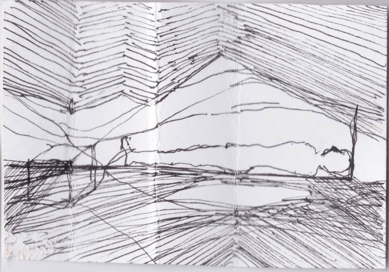
After researching the sublime and being inspired by the importance of water in our civilisation, I feel much closer to understanding the theories that are behind my artwork. I also feel that I am much closer to finding a visual form that will be able to encompass all of these increasingly complex ideas. Sometimes I am just on the cusp of being able to fully understand what the sublime is. My drawings definitely help me visualise things I don't yet understand. I want to stay working with the geometry of folds. I want to contrast a solid with a liquid.